The "choice" element enables the app users with a direct preview of a list on their mobile device. This is very useful for surveys, questionnaires and short choice lists. A Choice list may be single, multiple or ranked.
For example: being the owner of a cinema, you want to improve your establishment in order to better respond to the expectations of your customers and so you conduct a survey. You want to know among other things the gender of your customers, propose possible improvements with a list and know the favourite film genres of your customers.
In the back office.
- Go to the platform kizeoforms.com in Modify or Create a form.
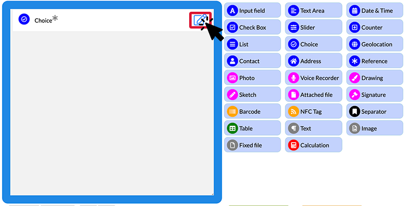
- Click on the Choice
- To access its features, go to the Options of the element by clicking on the pencil.
 At first glance, the Choice element works as a List.
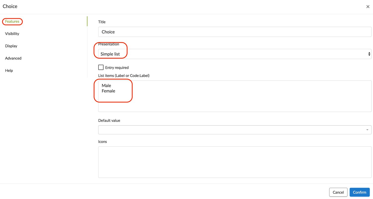
Single entry choice list.
In our example, we want to know the gender of the customer.
- Name it, select Presentation from the drop-down list: Single list and add the items that you want to appear.

To incorporate icons:
- Go to this website, choose your icons and insert them.
- Click on the desired icon and note the code corresponding to the icon. This code always starts with “fa-”.
- Fill in the “Icons” field with the desired icon codes in the same order as the list elements returned earlier.
- Do not forget to click Confirm.
Multiple entry choice list.
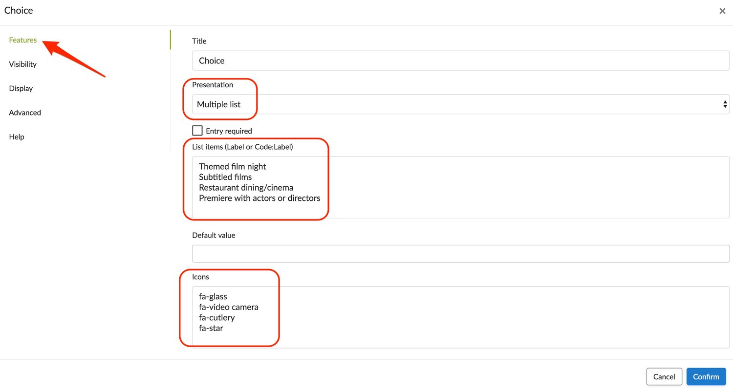
In our example, we propose various possible improvements for our cinema: themed film night, subtitled films, restaurant dining/cinema, premiere with actors or directors.
- In the options of the Choice element, select Presentation from the drop-down list: Multiple selection list. Once the entry is complete, confirm.

A raked choice list
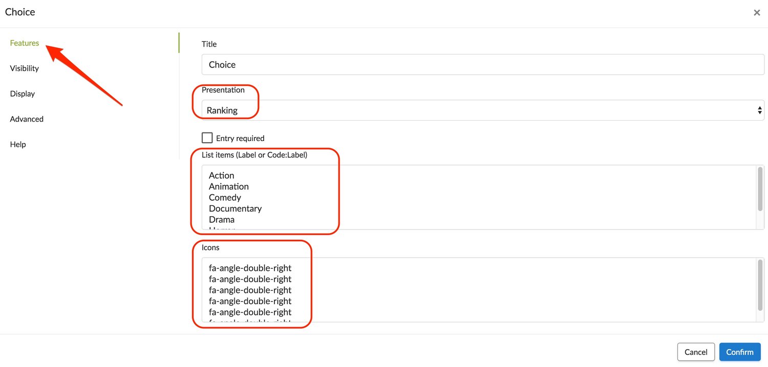
To complete our example, this time we want to know the preferences of our customers regarding film genres: Action, animation, comedy, documentary, drama, horror, science fiction and thrillers.
- In the options of the Choice element, select Presentation from the drop-down list: Ranking.

- Once the entry is complete, confirm.
On your mobile device.
See the appearance of the Choice element below on a mobile device. The eraser to the right of the table is used to clear responses from the list. .jpg?width=225&height=500&name=T1%20(8).jpg) Different displays allow you more freedom in the choice of responses.
Different displays allow you more freedom in the choice of responses. .jpg?width=500&height=500&name=T2%20(7).jpg)
