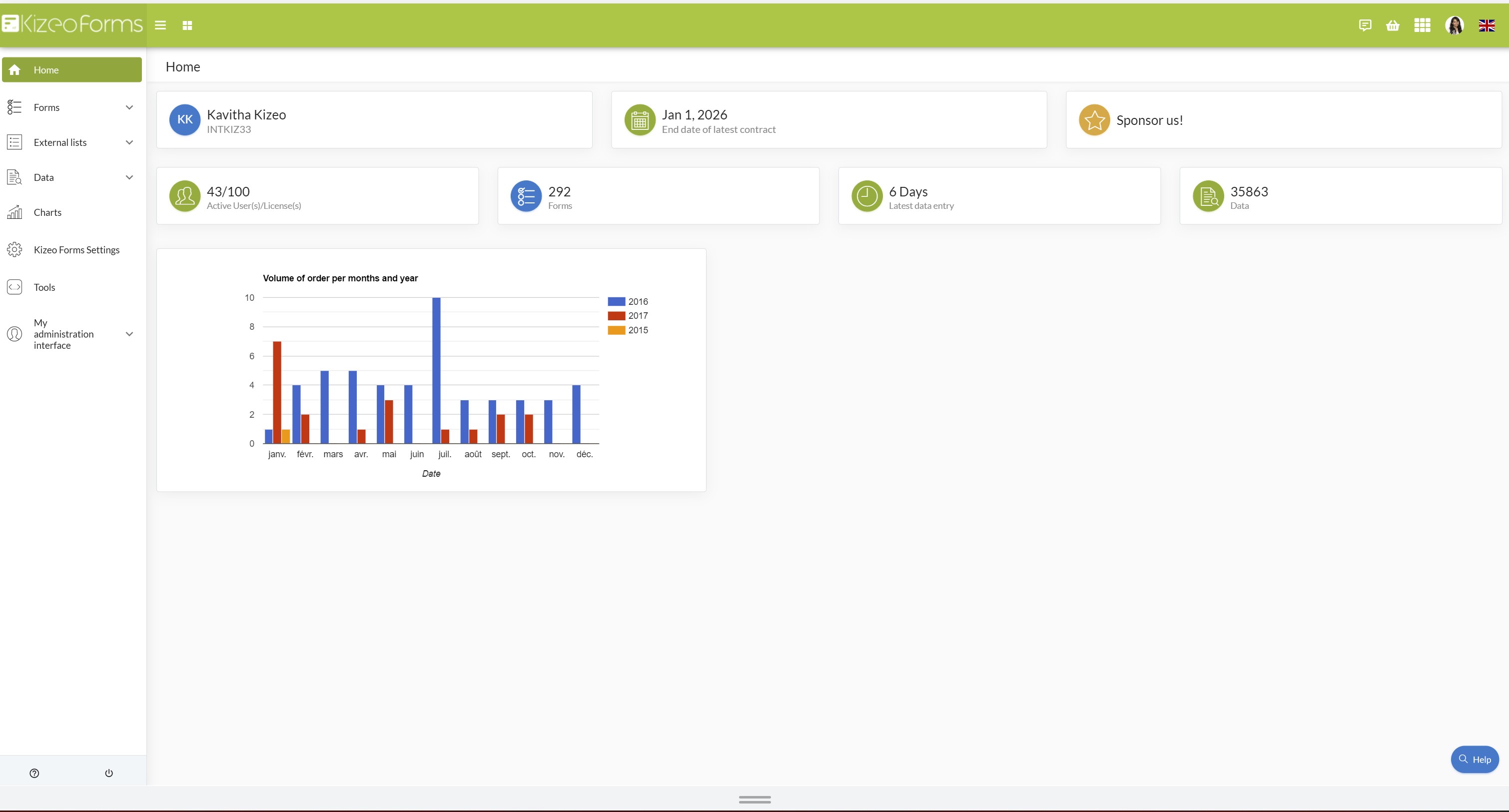
You can exploit and analyse your data with different graphs: pie chart, bar chart, line chart and curved line chart.You can moreover add your graph to your custom-made Word or Excel!
Example to help you learn to Analyse your data.
To establish orders, we have a purchase order form. In this form, we can find this following information: shipping method, sub total, date, type of client... Analyse your data with a chart to see trends and cycles of:
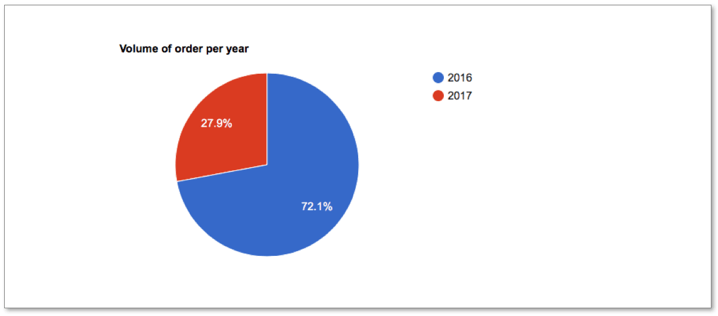
- Volume of order per year in a pie chart:
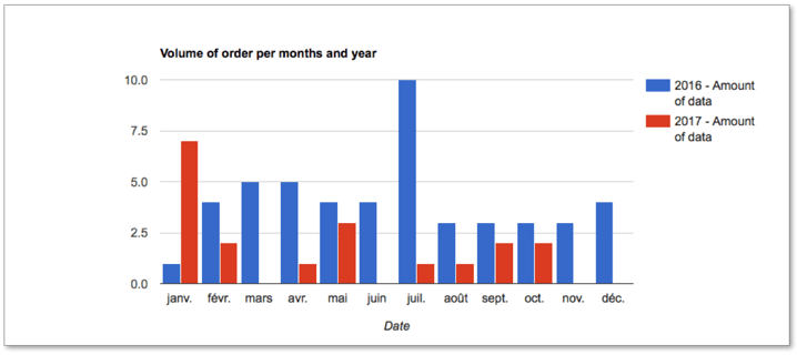
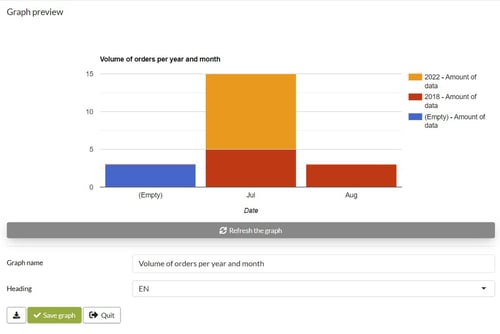
- Volume of order per months and year in a bar chart:
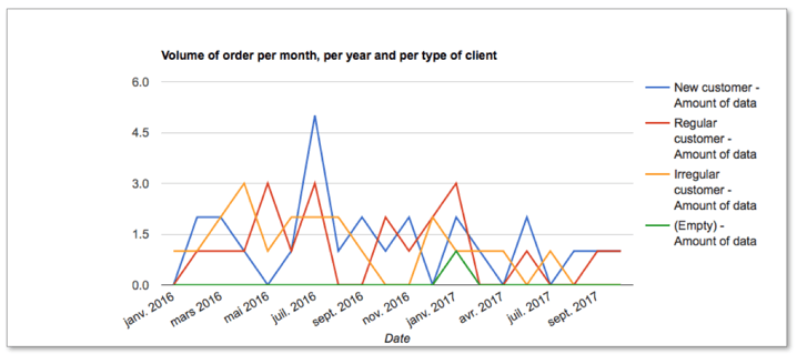
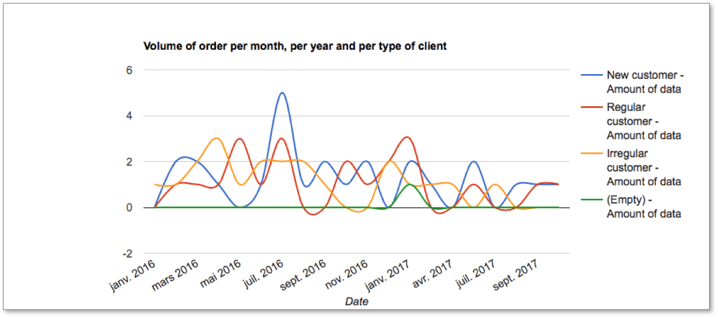
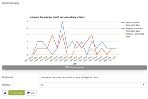
- Volume of order per month, per year and per type of client in a line chart:
 Analyse your data with a curved line chart:
Step 1: Volume of order per year in a pie chart.
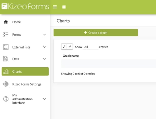
- Go to 'Charts'.
- Click on 'Create a graph'.
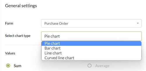
- The General settings appear. Select the form on which you wish to work by clicking on the scroll-down menu 'Select a form'. In our example, we select the 'Purchase order' form.
- Select the type of chart you wish to work on by clicking on the scroll-down menu 'Select chart type'. By default, the Pie chart is selected. To realise our first chart, we select the Pie chart.
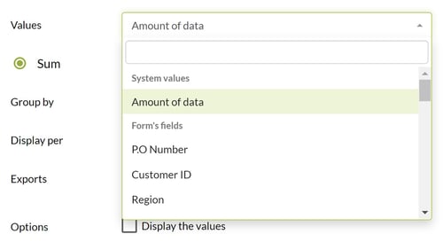
- You can add values to your chart by clicking on the scroll-down menu 'Values'. You can select 'Amount of data', in the 'System values' rubric, to use the number of the data entry, or select the specific value of your form in the rubric 'Form's fields'. In our example, we select 'Amount of data'.
- By checking 'Sum' or 'Average', you can decide if your graph should use the total of your data or the average. If you select 'amount of data on the scroll-down menu 'Values', you can not check 'Average' as the average of the amount of data is 1.

- Select the variable of your form on which you wish to group with the previous data by clicking on the scroll-down menu 'Group by'. We select 'Date'.
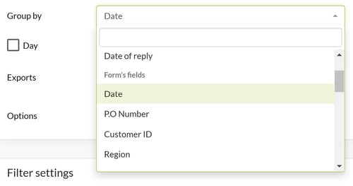
- By clicking on the corresponding checkbox, you can group your data by day, month or year. In our example, we want to group our data by year.

In the insert ' Graph preview', we can:
- Refresh the graph.
- Give a name to our graph in the input field 'Graph name'.
- Classify our graph in Heading by filling in the heading field.
- Click on 'Save Graph' to save your configuration.
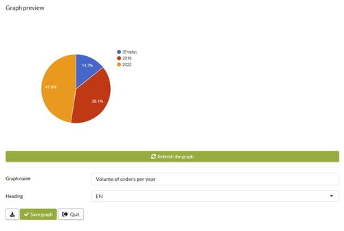
Step 2: Volume of order per months and year to analyse your data in a bar chart.
- Select the form on which you wish to work by clicking on the scroll-down menu 'Select a form'. In our example, we select the 'Purchase order' form.
- On the scroll-down menu 'Select chart type', we select the Bar chart.
- We can choose to have a Stacked bar graph by clicking on the check box 'Stacked bar graph'.
- We select 'Amount of data' on the scroll-down menu 'Values'.
- 'Sum' is checked.
- Select the variable of your form on which you wish to group with the previous data by clicking on the scroll-down menu 'Group by (legend)'. We select 'Date' and check 'Year'.

- Select the third variable of your form on which you wish to group with the previous data by clicking on the scroll-down menu 'Group by (abscissa)'.

We select ' Date' and this time, as we would like to know the volume of the month, we check ' Month'. In the insert ' Graph preview', we can:
- Give a name to our graph in the input field 'Graph name'.
- Classify our graph in Heading by filling in the heading field.
- Click on 'Save Graph' to save your configuration.
Step 3: Volume of orders per month, per year and per type of client in a line chart.
- In the 'General setting', select your form. We select our form 'Purchase order'.
- On the scroll-down menu 'Select chart type', you can select the Line chat or the Curved line chart.
- We select 'Amount of data' on the scroll-down menu 'Values'.
- Select the variable of your form on which you wish to group with the previous data by clicking on the scroll-down menu 'Group by (legend)'. We select 'Type of customer'.
- Select the third variable of your form on which you wish to group with the previous data by clicking on the scroll-down menu 'Group by (abscissa)'. We select 'Date' and check 'Month' and 'Year' as we want to obtain the volume of orders per type of client per month and year.

In the insert ' Graph preview', we can:
- Give a name to our graph in the input field 'Graph name'.
- Classify our graph in Heading by filling in the heading field.
- Click on 'Save Graph' to save your configuration.
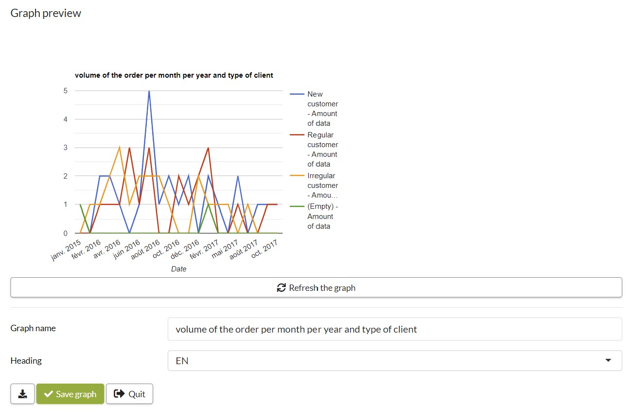
Note: In the graph key, we can find:
- The 'Empty' key. It appears when you add a field in the 'Group by (legend)' while some users did not fill it. In our example, some users did not fill the 'Type of customer' field.
- 'No defined' key. It appears in the 'Group by (legend)' when you add this field to the form while some data have already been entered.
Step 4: Filter settings.
In the ' Filter settings' part, by clicking on ' Add a filter, you can add a filter to your graph.

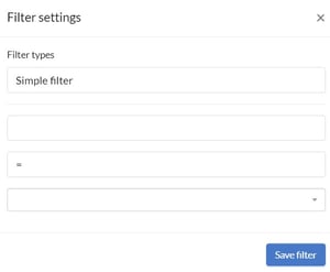 You can select a simple filter, dynamic date filter or customisable filter by clicking on the scroll-down menu ' Type of filter'.
The simple filter:
- After the scroll-down menu 'Type of filter', you can select a filter in the System values or in Form's field.
- And then, configure the Type of filter.
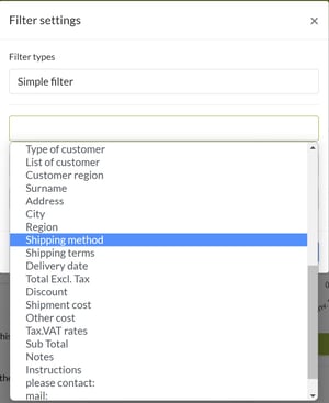
For example, for our Line bar ' Volume of order per month, per year and per type of client' we would like to filter the ' Type of customer' for our chart. We want to ignore the irregular customer. So, we select the ' Type of customer' field in the heading ' Form's field'.
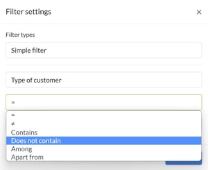
We select ' Does not contain' and ' Irregular customer'.
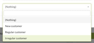 Do not forget to save your filter!
Dynamic date filter:
- After the scroll-down menu 'Type of filter', you can select a filter in the System values or in Form's field.
- And then, configure the Type of filter.
For example, for our Line bar ' Volume of order per month, per year and per type of client' we would like to filter the ' Date' for our chart. We want to obtain the order over a rolling 12 months period. So, we select ' Date' in the heading ' Form's field'.
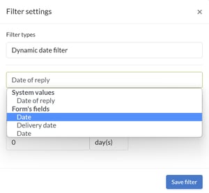
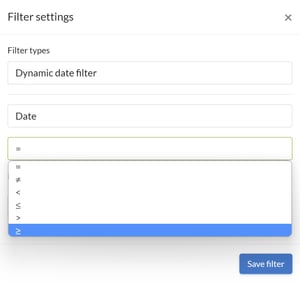
We select ' ≥'.
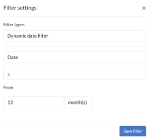
Then, we configure the date part: from 12 months.
Do not forget to save your filter!
Customisable filter:
This filter makes it possible to produce a customisable graph according to the current data or the value chosen by default. It can be useful when exporting the chart in a custom-made Word/ Excel. The result varies depending on the data we export.
- From the scroll-down menu 'Type of filter', you can select a filter in the System values or in Form's field.
- And then, configure the Type of filter.
For example, for our " Volume of order per month and year" bar chart, we want to filter the "Region" field. When exporting our custom report, our graph will only display the orders placed by our customers who have the same area as our store. That is to say, our shop based in the region PACA will have in its graph only its customers who would have ordered in his shop and who live in the region PACA. Our customers from PACA who have placed orders in our Occitania shop would not be counted.
First of all, we have to configure our first filter. It will allow us to only use the data, that the region of companies is the same as that present in our report. If the society, in our export, is that of Normandy; only the other data with the company is also in Normandy will be used to create our graph.
We select the Region’ field in the “Form’s field” heading.
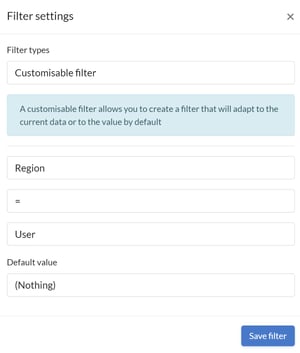
We select the ' Type of customer' field in the heading ' Form's field'. Then, we select ‘ =' and ‘ Region'.
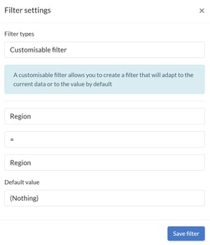
Do not forget to save your filter!
Now, we have to configure our second filter. This will allow us to only use the data that the region of our customer and our company are the same as that of our report. That is to say, if in our report, our company is based in the Corsica region, only customers and the company whose region is also Corsica in the same data will be added.
We select the Customer Region field in the Form’s field heading.
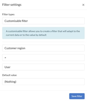
Then, we select ‘ =' and ‘ Region'.
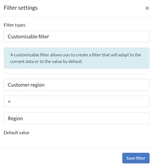
Do not forget to save your filter!
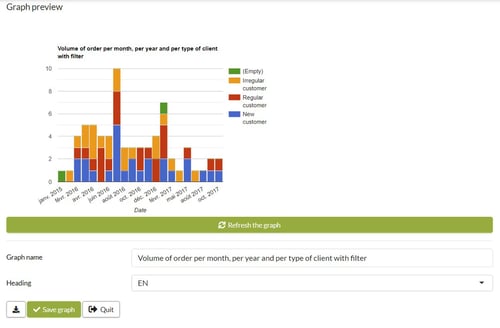 Note: We used a stacked bar graph.
Step 5: Add a graph to your custom-made report.
You can add any chart to your custom-made Word or Excel to make it easier to read your data.
Save your chart then click "Quit" or go directly to the homepage of your charts.
Simply click "#" to get the tag to add to your custom report.

Did you know it?
Your graph is updated every time you fill out your form. Even if you add a new user! Useful when you do not use your form every day!
You have the possibility to display one of your graphs on the homepage! To do this, go to Configuration -> Application -> Tools tab. Then select your graph in the drop-down menu!

